WEBLEB
Início
Editor
Entrar
Pro
Português
English
Français
Español
Português
Deutsch
Italiano
हिंदी
53796
webleb
Video
Publique Seu Código
12
Recomendado
16 October 2024
Calculadora
28 June 2025
Modelo de site de aluguel de bicicletas em HTML
index.html
Copy
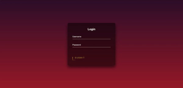
<!doctype html> <html lang="en"> <head> <title>Webleb</title> <!-- Required meta tags --> <meta charset="utf-8"> <meta name="viewport" content="width=device-width, initial-scale=1, shrink-to-fit=no"> <link href="/css/styles.css" rel="stylesheet"> </head> <body> <div class="login-box"> <h2>Login</h2> <form> <div class="user-box"> <input type="text" name="" required=""> <label>Username</label> </div> <div class="user-box"> <input type="password" name="" required=""> <label>Password</label> </div> <a href="#"> <span></span> <span></span> <span></span> <span></span> Submit </a> </form> </div> </body> </html>
styles.css
Copy
html { height: 100%; } body { margin:0; padding:0; font-family: sans-serif; background: linear-gradient(#30142b, #a12727); } .login-box { position: absolute; top: 50%; left: 50%; width: 400px; padding: 40px; transform: translate(-50%, -50%); background: rgba(0,0,0,.5); box-sizing: border-box; box-shadow: 0 15px 25px rgba(0,0,0,.6); border-radius: 10px; } .login-box h2 { margin: 0 0 30px; padding: 0; color: #fff; text-align: center; } .login-box .user-box { position: relative; } .login-box .user-box input { width: 100%; padding: 10px 0; font-size: 16px; color: #fff; margin-bottom: 30px; border: none; border-bottom: 1px solid #fff; outline: none; background: transparent; } .login-box .user-box label { position: absolute; top:0; left: 0; padding: 10px 0; font-size: 16px; color: #fff; pointer-events: none; transition: .5s; } .login-box .user-box input:focus ~ label, .login-box .user-box input:valid ~ label { top: -20px; left: 0; color: #f68e44; font-size: 12px; } .login-box form a { position: relative; display: inline-block; padding: 10px 20px; color: #b79726; font-size: 16px; text-decoration: none; text-transform: uppercase; overflow: hidden; transition: .5s; margin-top: 40px; letter-spacing: 4px } .login-box a:hover { background: #f49803; color: #fff; border-radius: 5px; box-shadow: 0 0 5px #f4c803, 0 0 25px #bd9d0b, 0 0 50px #f4e403, 0 0 100px #d5cf1e; } .login-box a span { position: absolute; display: block; } .login-box a span:nth-child(1) { top: 0; left: -100%; width: 100%; height: 2px; background: linear-gradient(90deg, transparent, #f4c003); animation: btn-anim1 1s linear infinite; } @keyframes btn-anim1 { 0% { left: -100%; } 50%,100% { left: 100%; } } .login-box a span:nth-child(2) { top: -100%; right: 0; width: 2px; height: 100%; background: linear-gradient(180deg, transparent, #f4bc03); animation: btn-anim2 1s linear infinite; animation-delay: .25s } @keyframes btn-anim2 { 0% { top: -100%; } 50%,100% { top: 100%; } } .login-box a span:nth-child(3) { bottom: 0; right: -100%; width: 100%; height: 2px; background: linear-gradient(270deg, transparent, #f4dc03); animation: btn-anim3 1s linear infinite; animation-delay: .5s } @keyframes btn-anim3 { 0% { right: -100%; } 50%,100% { right: 100%; } } .login-box a span:nth-child(4) { bottom: -100%; left: 0; width: 2px; height: 100%; background: linear-gradient(360deg, transparent, #f4b003); animation: btn-anim4 1s linear infinite; animation-delay: .75s } @keyframes btn-anim4 { 0% { bottom: -100%; } 50%,100% { bottom: 100%; } }
main.js
Copy
Nothing to copy