WEBLEB
Startseite
Editor
Anmelden
Pro
Deutsch
English
Français
Español
Português
Deutsch
Italiano
हिंदी
1849
Andev.web
Im Editor öffnen
Video
Veröffentlichen Sie Ihren Code
0
Empfohlen
14 March 2025
Preisinteraktion (HTML, CSS und JS)
31 July 2025
Der Code-Flüsterer
HTML
Copy
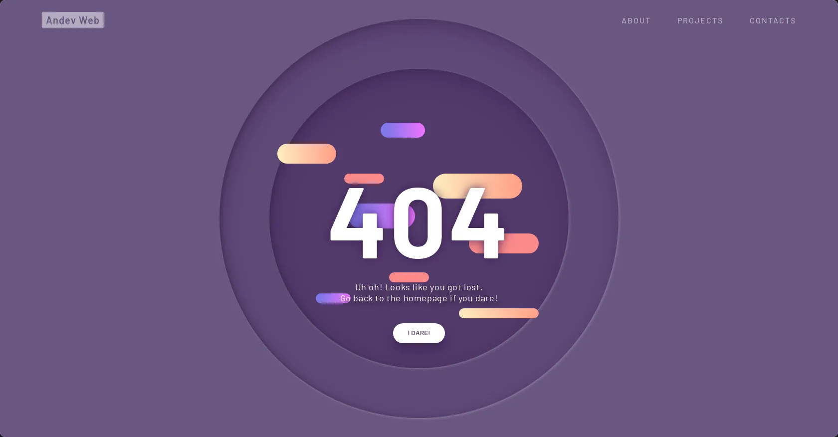
<!DOCTYPE html> <html lang="es" > <head> <meta charset="UTF-8"> <title>Andev Web</title> <link rel="stylesheet" href="./style.css"> </head> <body> <nav> <div class="menu"> <p class="website_name">Andev Web</p> <div class="menu_links"> <a href="" class="link">about</a> <a href="" class="link">projects</a> <a href="" class="link">contacts</a> </div> <div class="menu_icon"> <span class="icon"></span> </div> </div> </nav> <section class="wrapper"> <div class="container"> <div id="scene" class="scene" data-hover-only="false"> <div class="circle" data-depth="1.2"></div> <div class="one" data-depth="0.9"> <div class="content"> <span class="piece"></span> <span class="piece"></span> <span class="piece"></span> </div> </div> <div class="two" data-depth="0.60"> <div class="content"> <span class="piece"></span> <span class="piece"></span> <span class="piece"></span> </div> </div> <div class="three" data-depth="0.40"> <div class="content"> <span class="piece"></span> <span class="piece"></span> <span class="piece"></span> </div> </div> <p class="p404" data-depth="0.50">404</p> <p class="p404" data-depth="0.10">404</p> </div> <div class="text"> <article> <p>Uh oh! Looks like you got lost. <br>Go back to the homepage if you dare!</p> <button>i dare!</button> </article> </div> </div> </section> <script src='https://cdnjs.cloudflare.com/ajax/libs/parallax/3.1.0/parallax.min.js'></script> <script src='https://cdnjs.cloudflare.com/ajax/libs/jquery/2.1.3/jquery.min.js'></script><script src="./script.js"></script> </body> </html>
CSS
Copy
@import url("https://fonts.googleapis.com/css?family=Barlow+Condensed:300,400,500,600,700,800,900|Barlow:300,400,500,600,700,800,900&display=swap"); h1, h2, h3, h4, h5, h6, p, ul, li, button, a, i, input, body { margin: 0; padding: 0; list-style: none; border: 0; -webkit-tap-highlight-color: transparent; text-decoration: none; color: inherit; } h1:focus, h2:focus, h3:focus, h4:focus, h5:focus, h6:focus, p:focus, ul:focus, li:focus, button:focus, a:focus, i:focus, input:focus, body:focus { outline: 0; } body { margin: 0; padding: 0; height: auto; font-family: "Barlow", sans-serif; background: #695681; } .logo { position: fixed; z-index: 5; bottom: 10px; right: 10px; width: 40px; height: 40px; border-radius: 100%; display: flex; justify-content: center; align-items: center; background: rgba(0, 0, 0, 0.1); border-radius: 100%; backdrop-filter: blur(5px); } .logo img { width: 55%; height: 55%; transform: translateY(-1px); opacity: 0.8; } nav .menu { width: 100%; height: 80px; position: absolute; display: flex; align-items: center; justify-content: space-between; padding: 0 5%; box-sizing: border-box; z-index: 3; } nav .menu .website_name { color: #695681; font-weight: 600; font-size: 20px; letter-spacing: 1px; background: white; padding: 4px 8px; border-radius: 2px; opacity: 0.5; transition: all 0.4s ease; cursor: pointer; } nav .menu .website_name:hover { opacity: 1; } nav .menu .menu_links { transition: all 0.4s ease; opacity: 0.5; } nav .menu .menu_links:hover { opacity: 1; } @media screen and (max-width: 799px) { nav .menu .menu_links { display: none; } } nav .menu .menu_links .link { color: white; text-transform: uppercase; font-weight: 500; margin-right: 50px; letter-spacing: 2px; position: relative; transition: all 0.3s 0.2s ease; } nav .menu .menu_links .link:last-child { margin-right: 0; } nav .menu .menu_links .link:before { content: ""; position: absolute; width: 0px; height: 4px; background: linear-gradient(90deg, #FFEDC0 0%, #FF9D87 100%); bottom: -10px; border-radius: 4px; transition: all 0.4s cubic-bezier(0.82, 0.02, 0.13, 1.26); left: 100%; } nav .menu .menu_links .link:hover { opacity: 1; color: #FB8A8A; } nav .menu .menu_links .link:hover:before { width: 40px; left: 0; } nav .menu .menu_icon { width: 40px; height: 40px; position: relative; display: none; justify-content: center; align-items: center; cursor: pointer; } @media screen and (max-width: 799px) { nav .menu .menu_icon { display: flex; } } nav .menu .menu_icon .icon { width: 24px; height: 2px; background: white; position: absolute; } nav .menu .menu_icon .icon:before, nav .menu .menu_icon .icon:after { content: ""; width: 100%; height: 100%; background: inherit; position: absolute; transition: all 0.3s cubic-bezier(0.49, 0.04, 0, 1.55); } nav .menu .menu_icon .icon:before { transform: translateY(-8px); } nav .menu .menu_icon .icon:after { transform: translateY(8px); } nav .menu .menu_icon:hover .icon { background: #FFEDC0; } nav .menu .menu_icon:hover .icon:before { transform: translateY(-10px); } nav .menu .menu_icon:hover .icon:after { transform: translateY(10px); } .wrapper { display: grid; grid-template-columns: 1fr; justify-content: center; align-items: center; height: 100vh; overflow-x: hidden; } .wrapper .container { margin: 0 auto; transition: all 0.4s ease; display: flex; justify-content: center; align-items: center; position: relative; } .wrapper .container .scene { position: absolute; width: 100vw; height: 100vh; vertical-align: middle; } .wrapper .container .one, .wrapper .container .two, .wrapper .container .three, .wrapper .container .circle, .wrapper .container .p404 { width: 60%; height: 60%; top: 20% !important; left: 20% !important; min-width: 400px; min-height: 400px; } .wrapper .container .one .content, .wrapper .container .two .content, .wrapper .container .three .content, .wrapper .container .circle .content, .wrapper .container .p404 .content { width: 600px; height: 600px; display: flex; justify-content: center; align-items: center; position: absolute; top: 50%; left: 50%; transform: translate(-50%, -50%); animation: content 0.8s cubic-bezier(1, 0.06, 0.25, 1) backwards; } @keyframes content { 0% { width: 0; } } .wrapper .container .one .content .piece, .wrapper .container .two .content .piece, .wrapper .container .three .content .piece, .wrapper .container .circle .content .piece, .wrapper .container .p404 .content .piece { width: 200px; height: 80px; display: flex; position: absolute; border-radius: 80px; z-index: 1; animation: pieceLeft 8s cubic-bezier(1, 0.06, 0.25, 1) infinite both; } @keyframes pieceLeft { 50% { left: 80%; width: 10%; } } @keyframes pieceRight { 50% { right: 80%; width: 10%; } } @media screen and (max-width: 799px) { .wrapper .container .one, .wrapper .container .two, .wrapper .container .three, .wrapper .container .circle, .wrapper .container .p404 { width: 90%; height: 90%; top: 5% !important; left: 5% !important; min-width: 280px; min-height: 280px; } } @media screen and (max-height: 660px) { .wrapper .container .one, .wrapper .container .two, .wrapper .container .three, .wrapper .container .circle, .wrapper .container .p404 { min-width: 280px; min-height: 280px; width: 60%; height: 60%; top: 20% !important; left: 20% !important; } } .wrapper .container .text { width: 60%; height: 40%; min-width: 400px; min-height: 500px; position: absolute; margin: 40px 0; animation: text 0.6s 1.8s ease backwards; } @keyframes text { 0% { opacity: 0; transform: translateY(40px); } } @media screen and (max-width: 799px) { .wrapper .container .text { min-height: 400px; height: 80%; } } .wrapper .container .text article { width: 400px; position: absolute; bottom: 0; z-index: 4; display: flex; flex-direction: column; justify-content: center; align-items: center; text-align: center; bottom: 0; left: 50%; transform: translateX(-50%); } @media screen and (max-width: 799px) { .wrapper .container .text article { width: 100%; } } .wrapper .container .text article p { color: white; font-size: 18px; letter-spacing: 0.6px; margin-bottom: 40px; text-shadow: 6px 6px 10px #32243E; } .wrapper .container .text article button { height: 40px; padding: 0 30px; border-radius: 50px; cursor: pointer; box-shadow: 0px 15px 20px rgba(54, 24, 79, 0.5); z-index: 3; color: #695681; background-color: white; text-transform: uppercase; font-weight: 600; font-size: 12px; transition: all 0.3s ease; } .wrapper .container .text article button:hover { box-shadow: 0px 10px 10px -10px rgba(54, 24, 79, 0.5); transform: translateY(5px); background: #FB8A8A; color: white; } .wrapper .container .p404 { font-size: 200px; font-weight: 700; letter-spacing: 4px; color: white; display: flex !important; justify-content: center; align-items: center; position: absolute; z-index: 2; animation: anime404 0.6s cubic-bezier(0.3, 0.8, 1, 1.05) both; animation-delay: 1.2s; } @media screen and (max-width: 799px) { .wrapper .container .p404 { font-size: 100px; } } @keyframes anime404 { 0% { opacity: 0; transform: scale(10) skew(20deg, 20deg); } } .wrapper .container .p404:nth-of-type(2) { color: #36184F; z-index: 1; animation-delay: 1s; filter: blur(10px); opacity: 0.8; } .wrapper .container .circle { position: absolute; } .wrapper .container .circle:before { content: ""; position: absolute; width: 800px; height: 800px; background-color: rgba(54, 24, 79, 0.2); border-radius: 100%; top: 50%; left: 50%; transform: translate(-50%, -50%); box-shadow: inset 5px 20px 40px rgba(54, 24, 79, 0.25), inset 5px 0px 5px rgba(50, 36, 62, 0.3), inset 5px 5px 20px rgba(50, 36, 62, 0.25), 2px 2px 5px rgba(255, 255, 255, 0.2); animation: circle 0.8s cubic-bezier(1, 0.06, 0.25, 1) backwards; } @keyframes circle { 0% { width: 0; height: 0; } } @media screen and (max-width: 799px) { .wrapper .container .circle:before { width: 400px; height: 400px; } } .wrapper .container .one .content:before { content: ""; position: absolute; width: 600px; height: 600px; background-color: rgba(54, 24, 79, 0.3); border-radius: 100%; box-shadow: inset 5px 20px 40px rgba(54, 24, 79, 0.25), inset 5px 0px 5px rgba(50, 36, 62, 0.3), inset 5px 5px 20px rgba(50, 36, 62, 0.25), 2px 2px 5px rgba(255, 255, 255, 0.2); animation: circle 0.8s 0.4s cubic-bezier(1, 0.06, 0.25, 1) backwards; } @media screen and (max-width: 799px) { .wrapper .container .one .content:before { width: 300px; height: 300px; } } .wrapper .container .one .content .piece { background: linear-gradient(90deg, #8077EA 13.7%, #EB73FF 94.65%); } .wrapper .container .one .content .piece:nth-child(1) { right: 15%; top: 18%; height: 30px; width: 120px; animation-delay: 0.5s; animation-name: pieceRight; } .wrapper .container .one .content .piece:nth-child(2) { left: 15%; top: 45%; width: 150px; height: 50px; animation-delay: 1s; animation-name: pieceLeft; } .wrapper .container .one .content .piece:nth-child(3) { left: 10%; top: 75%; height: 20px; width: 70px; animation-delay: 1.5s; animation-name: pieceLeft; } .wrapper .container .two .content .piece { background: linear-gradient(90deg, #FFEDC0 0%, #FF9D87 100%); } .wrapper .container .two .content .piece:nth-child(1) { left: 0%; top: 25%; height: 40px; width: 120px; animation-delay: 2s; animation-name: pieceLeft; } .wrapper .container .two .content .piece:nth-child(2) { right: 15%; top: 35%; width: 180px; height: 50px; animation-delay: 2.5s; animation-name: pieceRight; } .wrapper .container .two .content .piece:nth-child(3) { right: 10%; top: 80%; height: 20px; width: 160px; animation-delay: 3s; animation-name: pieceRight; } .wrapper .container .three .content .piece { background: #FB8A8A; } .wrapper .container .three .content .piece:nth-child(1) { left: 25%; top: 35%; height: 20px; width: 80px; animation-name: pieceLeft; animation-delay: 3.5s; } .wrapper .container .three .content .piece:nth-child(2) { right: 10%; top: 55%; width: 140px; height: 40px; animation-name: pieceRight; animation-delay: 4s; } .wrapper .container .three .content .piece:nth-child(3) { left: 40%; top: 68%; height: 20px; width: 80px; animation-name: pieceLeft; animation-delay: 4.5s; }
JS
Copy
// Parallax Code var scene = document.getElementById('scene'); var parallax = new Parallax(scene);