WEBLEB
Home
Editor
Login
Pro
English
English
Français
Español
Português
Deutsch
Italiano
हिंदी
Glass effect social media buttons with neon glow
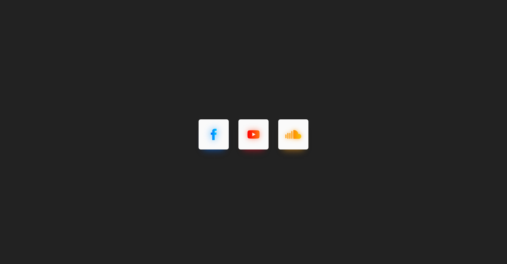
980
ytr3d3
Open In Editor
Publish Your Code
Recommended
30 January 2025
Buttons Gradient Hover
15 May 2025
Boutons Neon
6 November 2024
3D Text Effect
HTML
Copy
CodePen - Glass effect social media buttons with neon glow
CSS
Copy
html, body { background-color: #222222; transition: all 0.3s; height: 100%; } .button-container { display: flex; align-items: center; justify-content: center; height: 100%; } .glass-btn { width: 100px; height: 100px; background-color: #fafafa; display: flex; align-items: center; justify-content: center; border-radius: 7px; margin-left: 1em; margin-right: 1em; cursor: pointer; transition: all 0.3s; } .glass-btn.blue-btn { box-shadow: 0px 20px 20px -17px rgba(0, 111, 255, 0.53); } .glass-btn.blue-btn:hover { box-shadow: 0px 20px 35px -16px rgba(0, 111, 255, 0.65); } .glass-btn.blue-btn .content { font-size: 4em; font-family: "Roboto", sans-serif; background: linear-gradient(to right, #006fff, #00acff 70%); -webkit-background-clip: text; -webkit-text-fill-color: transparent; text-shadow: 0px 10px 37px rgba(0, 111, 255, 0.8); } .glass-btn.red-btn { box-shadow: 0px 20px 20px -17px rgba(255, 16, 39, 0.5); } .glass-btn.red-btn:hover { box-shadow: 0px 20px 35px -16px rgba(255, 16, 39, 0.57); } .glass-btn.red-btn .content { font-size: 4em; font-family: "Roboto", sans-serif; background: linear-gradient(to right, #ff1027, #ff4f06 70%); -webkit-background-clip: text; -webkit-text-fill-color: transparent; text-shadow: 0px 10px 37px rgba(255, 16, 39, 0.6); } .glass-btn.amber-btn { box-shadow: 0px 20px 20px -17px rgba(255, 159, 16, 0.53); } .glass-btn.amber-btn:hover { box-shadow: 0px 20px 35px -16px rgba(255, 159, 16, 0.6); } .glass-btn.amber-btn .content { font-size: 4em; font-family: "Roboto", sans-serif; background: linear-gradient(to right, #ff8d00, #f7ad07 70%); -webkit-background-clip: text; -webkit-text-fill-color: transparent; text-shadow: 0px 10px 37px rgba(255, 94, 16, 0.7); } .glass-btn:hover { background-color: whitesmoke; transform: translateY(-5px); transition: all 0.3s; }
JS
Copy
/* Replace with your JS Code (Leave empty if not needed) */