WEBLEB
Home
Editor
Login
Pro
English
English
Français
Español
Português
Deutsch
Italiano
हिंदी
loading
889
tousgreg
Open In Editor
Publish Your Code
Recommended
13 September 2025
CSS Loading Bar Animation HTML
16 October 2025
CSS Animated Background & Loading Effects
10 July 2025
CSS Animated Loading Screen HTML Example
HTML
Copy
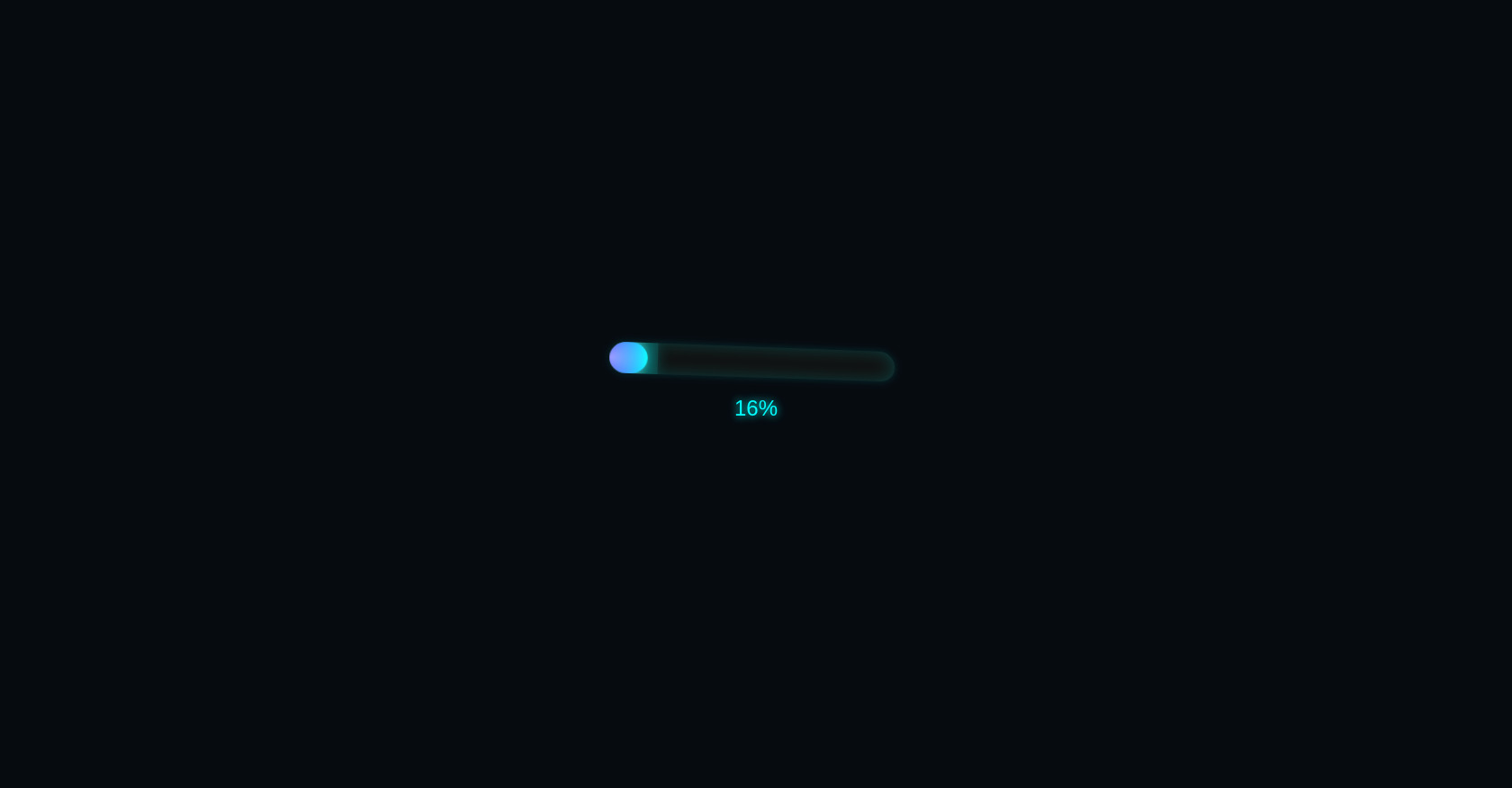
3D Neon Loader
0%
CSS
Copy
body { background: #060b10; font-family: 'Segoe UI', sans-serif; display: flex; flex-direction: column; align-items: center; justify-content: center; height: 100vh; margin: 0; color: #0ff; } .loader-container { perspective: 800px; text-align: center; } .loader-3d { width: 320px; height: 35px; background: #111; border-radius: 30px; box-shadow: inset 0 0 20px #0ff3, 0 0 10px #0ff2; overflow: hidden; transform: rotateX(12deg) rotateY(8deg); position: relative; } .bar { height: 100%; width: 0%; background: linear-gradient(90deg, #00f, #0ff); border-radius: 30px; box-shadow: 0 0 25px #0ff; position: relative; transition: width 0.2s ease; } .glow { position: absolute; top: 0; left: -100px; width: 100px; height: 100%; background: radial-gradient(circle, rgba(255,255,255,0.6) 0%, rgba(0,255,255,0.1) 80%); animation: moveGlow 2s linear infinite; mix-blend-mode: screen; pointer-events: none; } @keyframes moveGlow { 0% { left: -100px; } 100% { left: 100%; } } #percent { font-size: 1.5em; margin-top: 20px; text-shadow: 0 0 10px #0ff; }
JS
Copy
const bar = document.querySelector('.bar'); const percent = document.getElementById('percent'); let progress = 0; function animateLoader() { if (progress <= 100) { bar.style.width = progress + '%'; percent.textContent = progress + '%'; progress++; setTimeout(animateLoader, 40); // ajuster la vitesse } else { percent.textContent = 'Chargement terminé !'; } } animateLoader();