WEBLEB
Home
Editor
Login
Pro
English
English
Français
Español
Português
Deutsch
Italiano
हिंदी
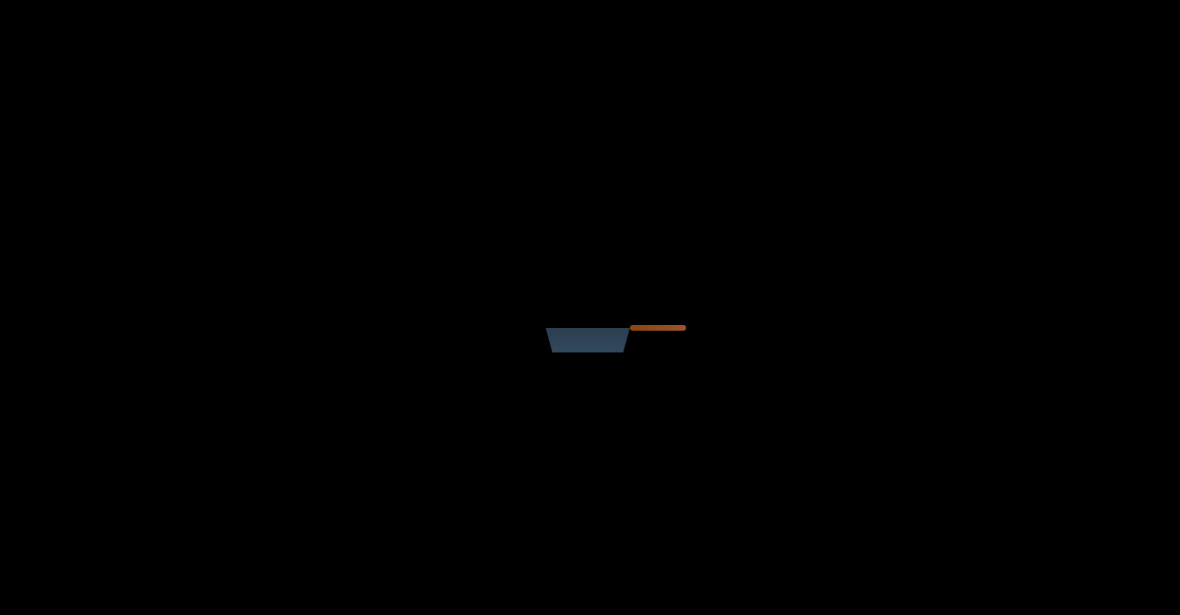
egg toasting loading
860
byby.createsite
Open In Editor
Publish Your Code
Recommended
11 January 2024
Dots Loading Screen
22 July 2025
CSS Loading Icon Spinner
16 October 2025
CSS Animation Example: Loading & Text Effects
HTML
Copy
CSS
Copy
*{ margin:0; padding:0; box-sizing:border-box; } body { font-family: Arial, sans-serif; background: black; display: flex; flex-direction: column; align-items: center; justify-content:center; height: 100vh; width:100vw; } .container-frigideira { z-index:1; animation: mexerPanela 2.5s ease-in-out infinite; } .ovo-container{ z-index:-1; left:20px; top:85px; transform:rotateX(55deg); animation: sincronizarComPanela 2.5s linear infinite; } @keyframes sincronizarComPanela { 0%, 50% { transform: translateX(20px) translateY(45px) rotateX(55deg); } 75% { transform: translateX(20px) translateY(-100px) rotateX(55deg); } 85%{transform: translateX(20px) translateY(-100px) rotateX(225deg);} 100% { transform: translateX(20px) translateY(45px) rotateX(225deg); } } @keyframes mexerPanela { 0% { transform: translateX(0); } 10% { transform: translateX(-25px); } 20% { transform: translateX(25px); } 30% { transform: translateX(-25px); } 40% { transform: translateX(25px); } 45%{ transform:translateX(0); } 50% { transform: translateX(0) translateY(-10px); } 60% { transform: translateX(0) translateY(0); } 100% { transform: translateX(0); } } .frigideira { width: 120px; height: 35px; transform:rotateZ(180deg); background: linear-gradient(to bottom, #34495e, #2c3e50); clip-path: polygon(8% 0%, 92% 0%, 100% 100%, 0% 100%); position: absolute; } /* Cabo da frigideira */ .cabo { position: relative; left:150%; top: 50%; width: 80px; height: 8px; background: linear-gradient(to right, #8B4513, #A0522D); border-radius: 4px; }
JS
Copy
/* Replace with your JS Code (Leave empty if not needed) */