WEBLEB
Home
Editor
Login
Pro
English
English
Français
Español
Português
Deutsch
Italiano
हिंदी
the enigma of time
263
ByBy.inc
Open In Editor
Publish Your Code
Recommended
12 July 2025
TheDoc Notes App
14 September 2024
Fishbowl - Save the fish
18 August 2024
Gallery of sites with hover and blur effect
HTML
Copy
.clock { animation: pulse 4s infinite; }
CSS
Copy
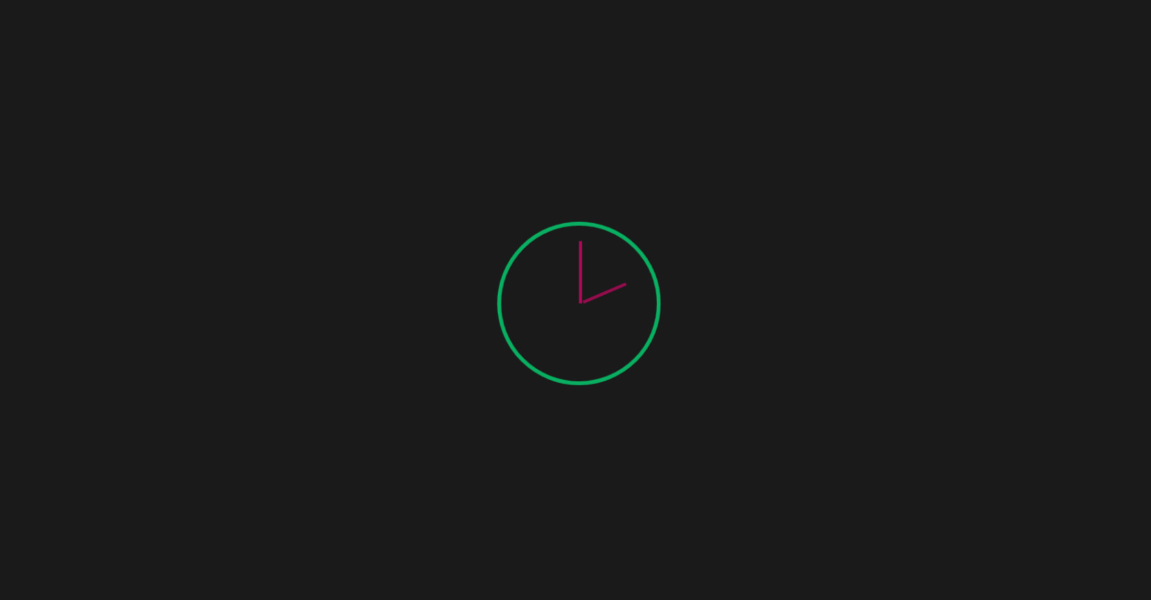
body { display: flex; justify-content: center; align-items: center; height: 100vh; margin: 0; background-color: #1a1a1a; overflow: hidden; font-family: monospace; color: #fff; } /*container do relogio */ .clock-container { position: relative; width: 200px; height: 200px; } /*relogio pulsando */ .clock { width: 100%; height: 100%; border: 5px solid #00ff88; border-radius: 50%; position: relative; animation: pulse 4s infinite; } /*ponteiros */ .hand { position: absolute; bottom: 50%; left: 50%; width: 4px; background-color: #ff0077; transform-origin: bottom; animation: dissolve 4s infinite; } /*ponteiro da hora */ .hour-hand { height: 60px; animation-delay: 0.5s; } /* ponteiro do minuto */ .minute-hand { height: 80px; animation-delay: 1s; } /*codigo depois */ .code-snippet { position: absolute; top: 50%; left: 50%; transform: translate(-50%, -50%); font-size: 14px; color: #00ff88; opacity: 0; animation: reveal-code 4s infinite; white-space: pre; } /*animações */ @keyframes pulse { 0%, 100% { transform: scale(1); opacity: 1; } 50% { transform: scale(1.2); opacity: 0.5; } } @keyframes dissolve { 0%, 100% { transform: rotate(0deg) translateY(0); opacity: 1; } 50% { transform: rotate(360deg) translateY(-20px); opacity: 0; } } @keyframes reveal-code { 0%, 40% { opacity: 0; } 50%, 90% { opacity: 1; } 100% { opacity: 0; } }
JS
Copy
/* Replace with your JS Code (Leave empty if not needed) */