WEBLEB
Home
Editor
Login
Pro
English
English
Français
Español
Português
Deutsch
Italiano
हिंदी
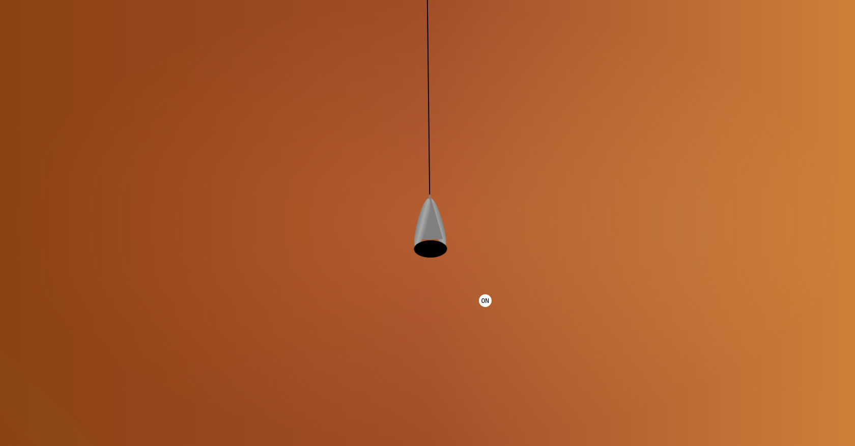
Animated Lamp
65
ByBy.inc
Open In Editor
Publish Your Code
Recommended
28 November 2024
Animated Menu
18 August 2024
Animated Slider | Swiper JS
8 February 2025
Animated Login Form HTML CSS
HTML
Copy
ON
CSS
Copy
*{ margin: 0; padding: 0; } .triangle-container{ background: linear-gradient(45deg,rgba(139,69,19,0.1) 2%, transparent 3%, transparent 7%,rgba(139,69,19,0.1) 8%),radial-gradient(ellipse at center, rgba(255,255,255,0.2) 0%, transparent 70%),linear-gradient(90deg, #8B4513 0%, #A0522D 50%, #CD853F 100%); background-blend-mode: overlay; background-size: cover; display: flex; flex-direction: column; align-items: center; justify-content: center; width: 100vw; height: 100vh; font-family: monospace; overflow: hidden; } .ellipse2{ position: absolute; left: 5px; width: 20px; height: 100px; background: linear-gradient(to right, #808080, #A9A9A9, #808080); border-radius: 50%; transform: rotate(15deg); } .mid{ position: absolute; align-self: center; top: 43%; width: 0; height: 0; border-left: 25px solid transparent; border-right: 25px solid transparent; border-bottom: 90px solid gray;} .ellipse3{ position: absolute; right: 5px; width: 20px; height: 100px; background: linear-gradient(to left, #808080, #A9A9A9, #808080); border-radius: 50%; transform: rotate(-15deg);} .cabe{ width: 2px; height: 500px; position: absolute; align-self: center; top: -50px; background-color: rgb(0, 0, 0);} .hole{ align-self: center; background: black; width: 65px; height: 34px; border-radius: 50%; position: absolute; top: 54%;} .transform-element{ position: absolute; background-color: transparent; height: 96vh; width: 60px; display: flex; justify-content: center; align-items: center; transform-origin: top; animation: animarLampada 5s linear infinite; } .toggle{ position: absolute; top: 66%; left: 56%; background: white; width: 25px; height: 25px; border-radius: 50%; color: black; display: flex; flex-direction: column; justify-content: center; align-items: center; font-family: monospace; cursor: default; user-select: none; } /* usando o active para evitar o js */ .toggle:active{ background: rgb(232, 232, 232); box-shadow: inset 1px 2px black; } /*acender a luz usando o interruptor sem javascript */ .toggle:active ~ .transform-element .hole{ background: goldenrod; box-shadow: 0 20px 40px 4px goldenrod; } /*animação simples */ @keyframes animarLampada{ 0%, 100%{transform:rotate(-2deg); } 50%{transform:rotate(2deg);}}
JS
Copy
/* Replace with your JS Code (Leave empty if not needed) */