WEBLEB
Home
Editor
Login
Pro
English
English
Français
Español
Português
Deutsch
Italiano
हिंदी
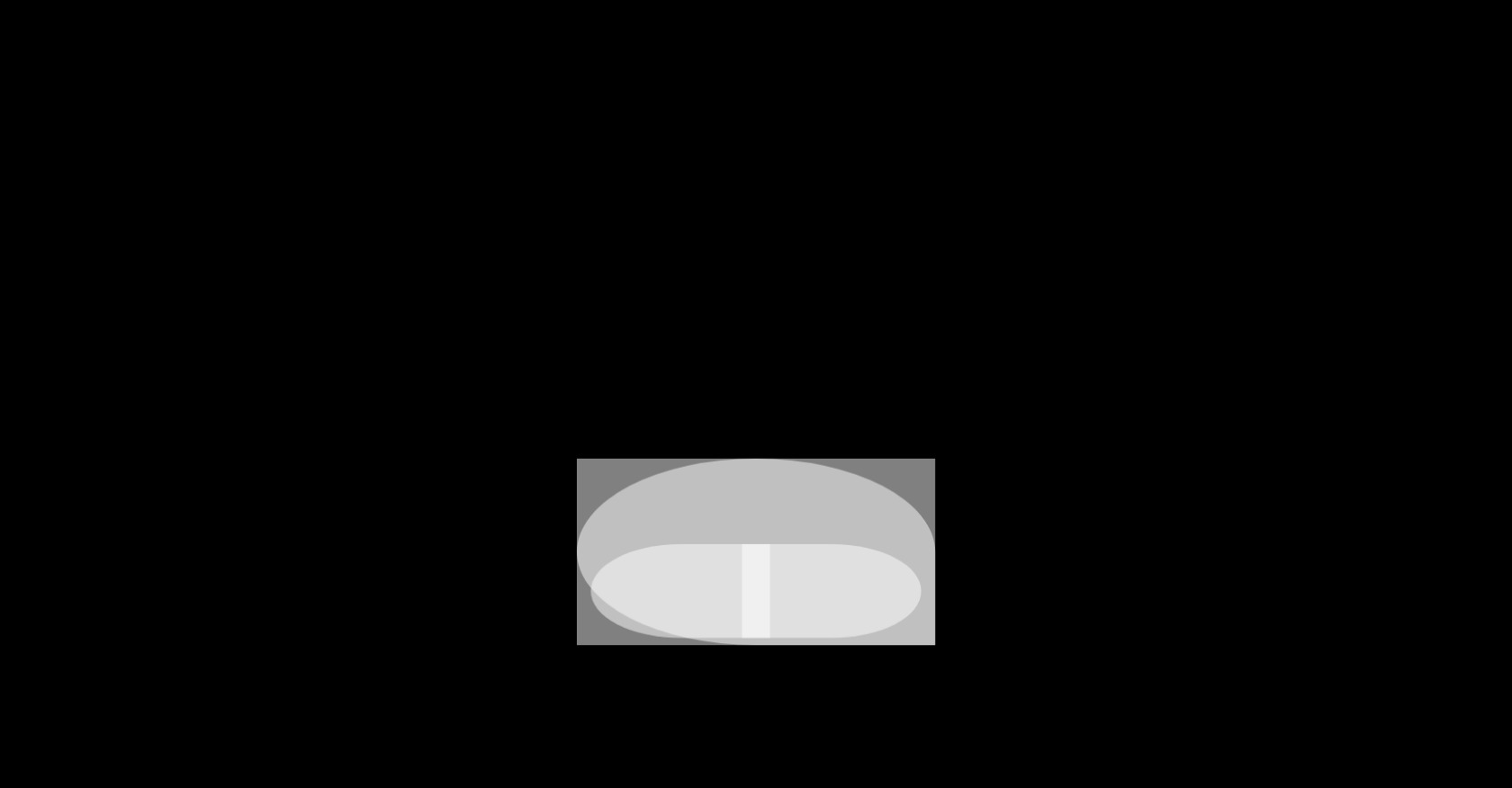
CSS Reflection Animation Example
403
ByBy.inc
Open In Editor
Publish Your Code
Recommended
21 July 2025
3D Login Signup Box HTML CSS Design
1 October 2025
CSS Loading Animation HTML Structure
19 July 2023
CSS Cards Carousel
HTML
Copy
CSS
Copy
/* Defina a base do CSS */ * { margin: 0; padding: 0; box-sizing: border-box; } body { background-color: black; background-size: cover; display: flex; align-items: center; justify-content: center; height: 100vh; overflow: hidden; } .codigo { position: absolute; top: 0; left: 50%; transform: translateX(-50%); background: #272822; color: #F8F8F2; font-family: 'Consolas', 'Monaco', monospace; font-size: 18px; padding: 20px; border-radius: 8px; white-space: pre-line; text-align: left; line-height: 1.6; max-height: 25%; max-width: 75%; width: 75%; height: 25%; top:15%; overflow-y: hidden; box-shadow: -8px 10px 18px rgba(0, 0, 0, 0.55); } .selector { color: #F92672; } .property { color: #66D9EF; } .value-number { color: #AE81FF; } .value-string { color: #E6DB74; } .value-color { color: #A6E22E; } .function { color: #A6E22E; } .animation-container { position: absolute; top: 75%; left: 50%; transform: translate(-50%, -50%); display: flex; align-items: center; justify-content: center; width: 100%; height: 50%; overflow: hidden; background: transparent; } /* Animação de refletos quebrados */ .refletos { position: relative; width: 20%; height: 20%; } .refleto1 { position: absolute; top: 0; left: 0; width: 50%; height: 100%; background-color: rgba(255, 255, 255, 0.5); border-radius: 50% 0 0 50%; } .refleto2 { position: absolute; top: 0; right: 0; width: 50%; height: 100%; background-color: rgba(255, 255, 255, 0.5); border-radius: 0 50% 50% 0; } .refleto3 { position: absolute; bottom: 0; left: 0; width: 100%; height: 200%; background-color: rgba(255, 255, 255, 0.5); border-radius: 50% 50% 0 0; } .refleto4 { position: absolute; bottom: 0; right: 0; width: 100%; height: 200%; background-color: rgba(255, 255, 255, 0.5); border-radius: 0 0 0 50%; } .refleto1, .refleto2, .refleto3, .refleto4 { animation: break-reflect 2s infinite; } @keyframes break-reflect { 0% { transform: scale(1); } 50% { transform: scale(1.2); } 100% { transform: scale(1); } } /* Animação de código */ .codigo-container { position: absolute; top: 0; left: 0; background-color: #282828; color: #F8F8F2; padding: 20px; border-radius: 8px; white-space: pre-line; text-align: left; line-height: 1.6; max-height: 50%; max-width: 50%; width: 50%; height: 50%; top: 25%; overflow-y: hidden; } .codigo-container .codigo { font-size: 12px; } .codigo-container .selector { color: #F92672; } .codigo-container .property { color: #66D9EF; } .codigo-container .value-number { color: #AE81FF; } .codigo-container .value-string { color: #E6DB74; } /* Animação de código quebrado */ .codigo-fragment { position: relative; width: 50%; height: 50%; background-color: rgba(255, 255, 255, 0.5); border-radius: 50%; } .fragment1 { position: absolute; top: 0; left: 0; width: 100%; height: 100%; background-color: rgba(255, 255, 255, 0.5); border-radius: 50% 0 0 50%; } .fragment2 { position: absolute; top: 0; right: 0; width: 100%; height: 100%; background-color: rgba(255, 255, 255, 0.5); border-radius: 0 50% 50% 0; } @keyframes break-fragment { 0% { transform: scale(1); } 50% { transform: scale(1.2); } 100% { transform: scale(1); } } .fragment1, .fragment2 { animation: break-fragment 2s infinite; } .fragment1, .fragment2{ box-shadow: 0 0 5px rgba(0,0,0,0.1); }
JS
Copy
/* Replace with your JS Code (Leave empty if not needed) */