WEBLEB
Home
Editor
Login
Pro
English
English
Français
Español
Português
Deutsch
Italiano
हिंदी
Text To Speek
2136
angrybird76
Open In Editor
Publish Your Code
Recommended
30 November 2024
Text Art
11 May 2024
Toggle On-Off
7 November 2024
Text Hover Animation Effect
HTML
Copy
<
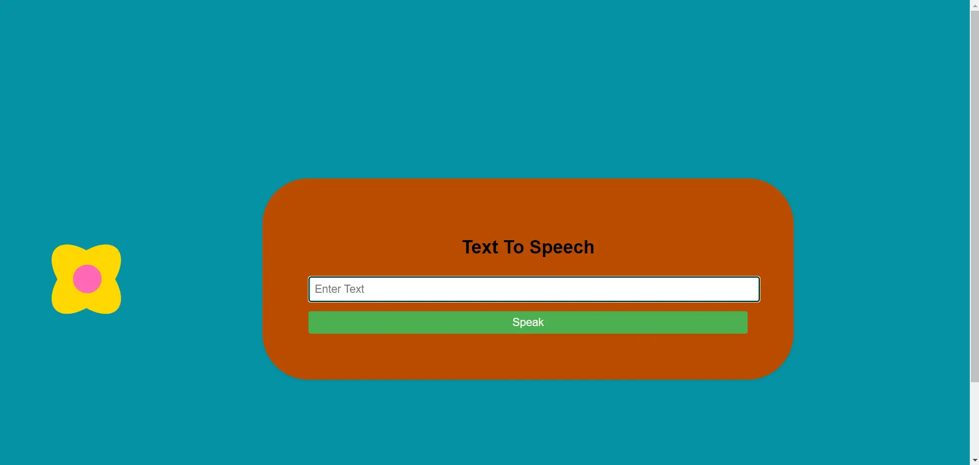
You can hear any word that you can't read
Text To Speech
Speak
!-- Replace with your HTML Code (Leave empty if not needed) -->
CSS
Copy
/ body { font-family: Arial, sans-serif; background-color: #0692a5; padding: 5rem; } main { width: 50%; margin: 0 auto; background-color: #bb4b00; padding: 5rem; border-radius: 5rem; box-shadow: 0 2px 4px rgba(0, 0, 0, 0.1); } h1 { text-align: center; margin-bottom: 2rem; } input { width: 100%; padding: 0.5rem; font-size: 1.2rem; border-radius: 0.25rem; border: 3px solid #22e9ce; margin-bottom: 1rem; } button { width: 100%; padding: 0.5rem; font-size: 1.2rem; background-color: #4caf50; color: #fcf7f7; border: none; border-radius: 0.25rem; cursor: pointer; } button:hover { background-color: #45a049; } body { display: flex; justify-content: center; align-items: center; height: 100vh; margin: 0; } .flower { position: relative; width: 150px; height: 150px; } .petal { position: absolute; width: 80px; height: 150px; background-color: #FFD700; border-radius: 50%; left: 20%; } .petal:nth-child(1) { transform: rotate(45deg); } .petal:nth-child(2) { transform: rotate(135deg); } .petal:nth-child(3) { transform: rotate(225deg); } .petal:nth-child(4) { transform: rotate(315deg); } .center { position: absolute; width: 50px; height: 50px; background-color: #FF69B4; border-radius: 50%; top: 50%; left: 48%; transform: translate(-50%, -50%); } * Replace with your CSS Code (Leave empty if not needed) */
JS
Copy
function speak() { const textInputField = document.querySelector("#text-input"); const utterThis = new SpeechSynthesisUtterance(textInputField.value); const synth = window.speechSynthesis; synth.speak(utterThis); }/* Replace with your JS Code (Leave empty if not needed) */