WEBLEB
Home
AI Editor
Login
Pro
English
English
Français
Español
Português
Deutsch
Italiano
हिंदी
3D Holographic Login Form HTML
14
securearray494
Open In Editor
Video
Publish Your Code
0
Recommended
5 June 2024
Free Simple HTML Login Form
18 December 2023
Text Animation in HTML and CSS
22 January 2026
Airlines HTML Template: Tailwind, Smooth Scroll, Icons
HTML
Copy
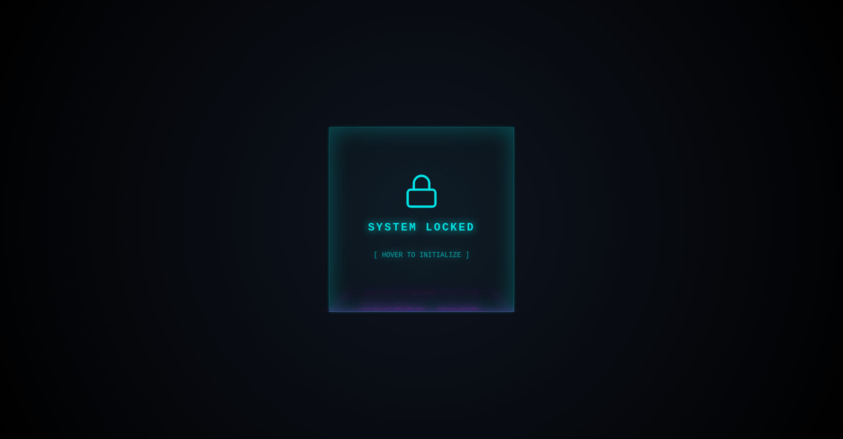
3D Holographic Login
SYSTEM LOCKED
[ HOVER TO INITIALIZE ]
Access Node
Neural ID
Decryption Key
Login
CSS
Copy
* { box-sizing: border-box; } body { margin: 0; height: 100vh; display: flex; justify-content: center; align-items: center; background-color: #050508; background-image: radial-gradient(circle at center, #0f1520 0%, #000 100%); font-family: 'Courier New', Courier, monospace; overflow: hidden; } /* 3D Scene Setup */ .scene { width: 320px; height: 320px; perspective: 1200px; } .hologram-cube { width: 100%; height: 100%; position: relative; transform-style: preserve-3d; /* Springy, unusual rotation curve */ transition: transform 1.2s cubic-bezier(0.25, 0.1, 0.25, 1.4); } /* Trigger the 3D roll on hover or when an input is focused */ .scene:hover .hologram-cube, .hologram-cube:focus-within { transform: rotateX(90deg); } /* Shared Panel Styling */ .panel { position: absolute; width: 320px; height: 320px; background: rgba(0, 255, 255, 0.03); border: 1px solid rgba(0, 255, 255, 0.3); box-shadow: 0 0 30px rgba(0, 255, 255, 0.1) inset, 0 0 20px rgba(0, 255, 255, 0.1); display: flex; flex-direction: column; justify-content: center; align-items: center; backdrop-filter: blur(8px); -webkit-backdrop-filter: blur(8px); } /* Front Face (Idle State) */ .front-panel { transform: rotateY(0deg) translateZ(160px); color: #0ff; text-shadow: 0 0 15px #0ff; animation: hologram-pulse 2s infinite alternate; } /* Bottom Face (The Actual Form) */ .login-panel { /* Rotated to be the floor, pushed down by half its height */ transform: rotateX(-90deg) translateZ(160px); padding: 40px; background: rgba(15, 5, 25, 0.4); border-color: rgba(255, 0, 255, 0.4); box-shadow: 0 0 30px rgba(255, 0, 255, 0.1) inset, 0 0 20px rgba(255, 0, 255, 0.1); } /* Form Elements Styling */ h2 { color: #f0f; text-transform: uppercase; letter-spacing: 5px; margin-top: 0; margin-bottom: 35px; text-shadow: 0 0 15px #f0f; } .input-group { position: relative; width: 100%; margin-bottom: 30px; } input { width: 100%; padding: 10px 0; background: transparent; border: none; border-bottom: 2px solid rgba(255, 0, 255, 0.3); color: #fff; font-size: 16px; outline: none; transition: border-color 0.3s, box-shadow 0.3s; } input:focus { border-bottom-color: #0ff; box-shadow: 0 10px 10px -10px #0ff; } label { position: absolute; top: 10px; left: 0; color: rgba(255, 0, 255, 0.6); pointer-events: none; transition: 0.3s ease all; text-transform: uppercase; font-size: 14px; letter-spacing: 2px; } /* Float the label up when input is focused or filled */ input:focus ~ label, input:valid ~ label { top: -18px; font-size: 10px; color: #0ff; text-shadow: 0 0 8px #0ff; } button { width: 100%; padding: 15px; background: transparent; border: 1px solid #f0f; color: #f0f; font-family: inherit; font-weight: bold; font-size: 14px; text-transform: uppercase; letter-spacing: 4px; cursor: pointer; transition: all 0.3s; box-shadow: 0 0 15px rgba(255, 0, 255, 0.2) inset; margin-top: 10px; } button:hover { background: #f0f; color: #000; box-shadow: 0 0 20px #f0f, 0 0 40px #f0f; border-color: #fff; } /* Animations */ @keyframes hologram-pulse { 0% { opacity: 0.7; box-shadow: 0 0 20px rgba(0, 255, 255, 0.1) inset; } 100% { opacity: 1; box-shadow: 0 0 50px rgba(0, 255, 255, 0.4) inset, 0 0 10px rgba(0, 255, 255, 0.3); } }
JS
Copy
/* Replace with your JS Code (Leave empty if not needed) */