WEBLEB
Home
Editor
Login
Pro
English
English
Français
Español
Português
Deutsch
Italiano
हिंदी
Login/Register Form V2
18865
webleb
Publish Your Code
Recommended
25 August 2024
Glassmorphic Sign in Form
18 June 2025
HTML Login Form Template
22 May 2025
FORMULAIRE
index.html
Copy
Webleb
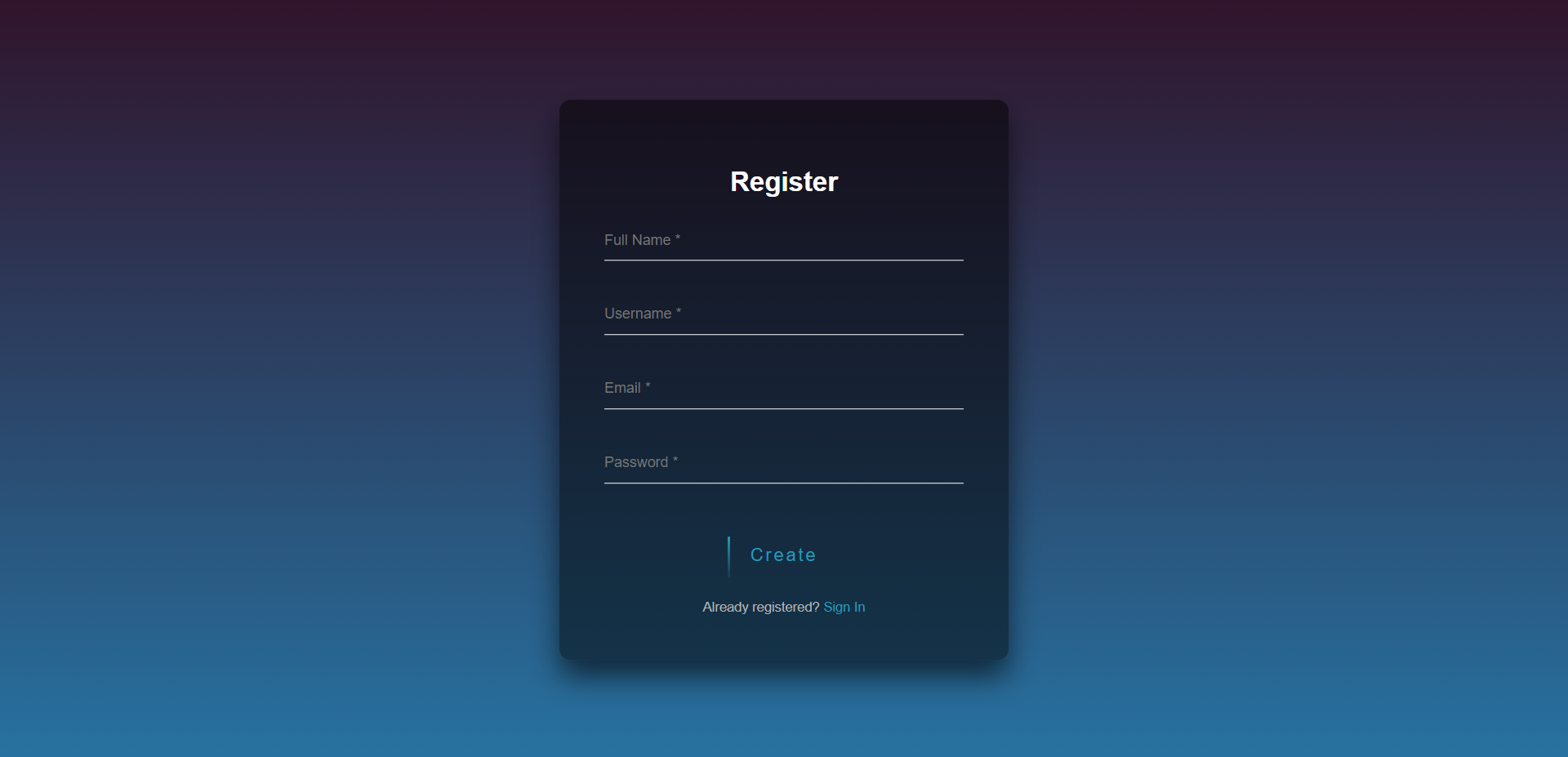
Register
Create
Already registered?
Sign In
Login
Sign in
Not registered?
Create an account
styles.css
Copy
@import url(https://fonts.googleapis.com/css?family=Poppins:300); html { height: 100%; } body{ margin:0; padding:0; font-family: sans-serif; background: linear-gradient(#30142b, #2772a1); } .login-page { width: 400px; padding: 8% 0 0; margin: auto; } .form { position: relative; z-index: 1; text-align: center; position: absolute; top: 50%; left: 50%; width: 400px; padding: 40px; transform: translate(-50%, -50%); background: rgba(0,0,0,.5); box-sizing: border-box; box-shadow: 0 15px 25px rgba(0,0,0,.6); border-radius: 10px; } .form input { width: 100%; padding: 10px 0; font-size: 13px; color: #fff; margin-bottom: 30px; border: none; border-bottom: 1px solid #fff; outline: none; background: transparent; } h2{ color:white; } .form .message { margin: 15px 0 0; color: #b3b3b3; font-size: 12px; } .form .message a { color: #289bb8; text-decoration: none; } .form .register-form { display: none; } .btn { position: relative; display: inline-block; padding: 10px 20px; color: #289bb8; font-size: 16px; text-decoration: none; overflow: hidden; transition: .5s; margin-top: 15px; letter-spacing: 2px } .btn:hover { background: #289bb8; color: #fff; border-radius: 5px; box-shadow: 0 0 5px #289bb8, 0 0 25px #289bb8, 0 0 50px #289bb8, 0 0 100px #289bb8; } .btn span { position: absolute; display: block; } .btn span:nth-child(1) { top: 0; left: -100%; width: 100%; height: 2px; background: linear-gradient(90deg, transparent, #289bb8); animation: btn-anim1 1s linear infinite; } @keyframes btn-anim1 { 0% { left: -100%; } 50%,100% { left: 100%; } } .btn span:nth-child(2) { top: -100%; right: 0; width: 2px; height: 100%; background: linear-gradient(180deg, transparent, #289bb8); animation: btn-anim2 1s linear infinite; animation-delay: .25s } @keyframes btn-anim2 { 0% { top: -100%; } 50%,100% { top: 100%; } } .btn span:nth-child(3) { bottom: 0; right: -100%; width: 100%; height: 2px; background: linear-gradient(270deg, transparent, #289bb8); animation: btn-anim3 1s linear infinite; animation-delay: .5s } @keyframes btn-anim3 { 0% { right: -100%; } 50%,100% { right: 100%; } } .btn span:nth-child(4) { bottom: -100%; left: 0; width: 2px; height: 100%; background: linear-gradient(360deg, transparent, #289bb8); animation: btn-anim4 1s linear infinite; animation-delay: .75s } @keyframes btn-anim4 { 0% { bottom: -100%; } 50%,100% { bottom: 100%; } }
main.js
Copy
$('.message a').click(function(){ $('form').animate({height: "toggle", opacity: "toggle"}, "slow"); });