WEBLEB
Accueil
Éditeur
Chat
Connexion
Pro
Français
English
Français
Español
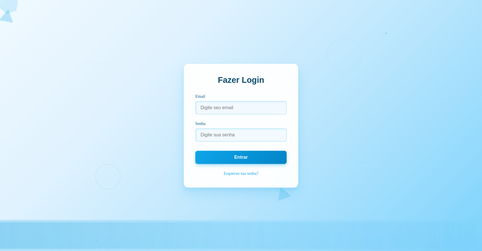
Formulaire de connexion HTML avec arrière-plan géométrique
1,526
0
Formulaires
byby.createsite
Suivre
0
Remixer
Ouvrir dans l'éditeur
Plein écran
Discuter
Publiez votre code
0
Recommandé
27 May 2025
Un code par mironovbogdan341
29 September 2026
Intégration d'un jeu voxel dans navigateur avec HTML et JavaScript
28 May 2026
Code source HTML du Retro Bowl
HTML
Copy
Fazer Login
Email
Senha
Entrar
Esqueceu sua senha?
CSS
Copy
* { margin: 0; padding: 0; box-sizing: border-box; } body { height: 100vh; overflow: hidden; background: linear-gradient(135deg, #f0f9ff 0%, #e0f2fe 30%, #bae6fd 60%, #7dd3fc 100% ); position: relative; } /* Formas geométricas flutuantes */ .geometric-shapes { position: absolute; width: 100%; height: 100%; } .shape { position: absolute; opacity: 0.6; animation: floatSmooth 12s ease-in-out infinite; } /* Hexágonos */ .hexagon { width: 60px; height: 34px; background: rgba(56, 189, 248, 0.3); position: relative; } .hexagon:before, .hexagon:after { content: ""; position: absolute; width: 0; border-left: 30px solid transparent; border-right: 30px solid transparent; } .hexagon:before { bottom: 100%; border-bottom: 17px solid rgba(56, 189, 248, 0.3); } .hexagon:after { top: 100%; border-top: 17px solid rgba(56, 189, 248, 0.3); } /* Triângulos */ .triangle { width: 0; height: 0; border-left: 25px solid transparent; border-right: 25px solid transparent; border-bottom: 43px solid rgba(14, 165, 233, 0.4); } .shape:nth-child(4) { top: 10%; right: 30%; animation-delay: -2s; } .shape:nth-child(5) { bottom: 20%; right: 40%; animation-delay: -6s; } .shape:nth-child(6) { top: 70%; left: 70%; animation-delay: -10s; } @keyframes floatSmooth { 0%, 100% { transform: translateY(0px) rotate(0deg); opacity: 0.6; } 33% { transform: translateY(-20px) rotate(120deg); opacity: 0.8; } 66% { transform: translateY(10px) rotate(240deg); opacity: 0.4; } } .wave { position: absolute; bottom: 0; left: 0; width: 200%; height: 100px; background: linear-gradient(90deg, transparent, rgba(56, 189, 248, 0.1), rgba(14, 165, 233, 0.2), rgba(56, 189, 248, 0.1), transparent ); border-radius: 100px; animation: gentleWave 15s ease-in-out infinite; } .wave:nth-child(2) { animation-delay: -5s; opacity: 0.7; } .wave:nth-child(3) { animation-delay: -10s; opacity: 0.5; } @keyframes gentleWave { 0%, 100% { transform: translateX(-50%) translateY(0px); } 50% { transform: translateX(-50%) translateY(-10px); } } /* Partículas mínimas */ .minimal-particles { position: absolute; width: 100%; height: 100%; } .dot { position: absolute; width: 4px; height: 4px; background: rgba(14, 165, 233, 0.6); border-radius: 50%; animation: gentleFloat 20s linear infinite; } .dot:nth-child(1) { left: 20%; animation-delay: 0s; } .dot:nth-child(2) { left: 40%; animation-delay: -5s; } .dot:nth-child(3) { left: 60%; animation-delay: -10s; } .dot:nth-child(4) { left: 80%; animation-delay: -15s; } @keyframes gentleFloat { 0% { transform: translateY(100vh); opacity: 0; } 10%, 90% { opacity: 1; } 100% { transform: translateY(-10vh); opacity: 0; } } /* Linhas sutis */ .subtle-lines { position: absolute; width: 100%; height: 100%; } .line { position: absolute; height: 1px; background: linear-gradient(90deg, transparent, rgba(56, 189, 248, 0.3), transparent ); animation: subtleGlow 8s ease-in-out infinite; } .line:nth-child(1) { width: 200px; top: 25%; left: 15%; transform: rotate(30deg); } .line:nth-child(2) { width: 150px; bottom: 35%; right: 20%; transform: rotate(-45deg); animation-delay: -4s; } @keyframes subtleGlow { 0%, 100% { opacity: 0.2; transform: scale(1); } 50% { opacity: 0.6; transform: scale(1.1); } } /* Círculos suaves */ .soft-circles { position: absolute; width: 100%; height: 100%; } .circle { position: absolute; border: 1px solid rgba(56, 189, 248, 0.3); border-radius: 50%; animation: breathe 10s ease-in-out infinite; } .circle:nth-child(1) { width: 120px; height: 120px; top: 15%; right: 25%; } .circle:nth-child(2) { width: 80px; height: 80px; bottom: 25%; left: 20%; animation-delay: -5s; } @keyframes breathe { 0%, 100% { transform: scale(1); opacity: 0.4; } 50% { transform: scale(1.1); opacity: 0.7; } } /* Container de Login */ .login-container { position: relative; z-index: 10; display: flex; align-items: center; justify-content: center; height: 100vh; } .login-box { background: rgba(255, 255, 255, 0.95); backdrop-filter: blur(10px); border-radius: 16px; padding: 2.5rem; width: 400px; box-shadow: 0 20px 40px rgba(14, 165, 233, 0.15), 0 8px 16px rgba(14, 165, 233, 0.1), inset 0 1px 0 rgba(255, 255, 255, 0.8); border: 1px solid rgba(56, 189, 248, 0.2); transition: transform 0.3s ease; } .login-box:hover { transform: translateY(-2px); box-shadow: 0 25px 50px rgba(14, 165, 233, 0.2), 0 12px 24px rgba(14, 165, 233, 0.15), inset 0 1px 0 rgba(255, 255, 255, 0.8); } .login-title { text-align: center; color: #0c4a6e; font-size: 1.8rem; font-weight: 600; margin-bottom: 2rem; font-family: 'Arial', sans-serif; } .form-group { margin-bottom: 1.5rem; } .form-label { display: block; color: #075985; font-size: 0.9rem; font-weight: 500; margin-bottom: 0.5rem; } .form-input { width: 100%; padding: 0.75rem 1rem; border: 2px solid rgba(56, 189, 248, 0.3); border-radius: 8px; font-size: 1rem; background: rgba(240, 249, 255, 0.8); color: #0c4a6e; transition: all 0.3s ease; box-shadow: inset 2px 2px 4px rgba(14, 165, 233, 0.1), inset -2px -2px 4px rgba(255, 255, 255, 0.8); } .form-input:focus { outline: none; border-color: #0ea5e9; background: rgba(240, 249, 255, 1); box-shadow: 0 0 0 3px rgba(14, 165, 233, 0.1), inset 2px 2px 6px rgba(14, 165, 233, 0.15), inset -2px -2px 6px rgba(255, 255, 255, 0.9); transform: translateY(-1px); } .login-button { width: 100%; padding: 0.875rem; background: linear-gradient(135deg, #0ea5e9, #0284c7); color: white; border: none; border-radius: 8px; font-size: 1rem; font-weight: 600; cursor: pointer; transition: all 0.2s ease; box-shadow: 0 6px 12px rgba(14, 165, 233, 0.3), 0 2px 4px rgba(14, 165, 233, 0.2), inset 0 1px 0 rgba(255, 255, 255, 0.2); margin-top: 0.5rem; } .login-button:hover { background: linear-gradient(135deg, #0284c7, #0369a1); transform: translateY(-2px); box-shadow: 0 8px 16px rgba(14, 165, 233, 0.4), 0 4px 8px rgba(14, 165, 233, 0.3), inset 0 1px 0 rgba(255, 255, 255, 0.2); } .login-button:active { transform: translateY(0px); box-shadow: 0 2px 4px rgba(14, 165, 233, 0.3), 0 1px 2px rgba(14, 165, 233, 0.2), inset 0 2px 4px rgba(0, 0, 0, 0.1); } .forgot-password { text-align: center; margin-top: 1.5rem; } .forgot-password a { color: #0ea5e9; text-decoration: none; font-size: 0.9rem; transition: color 0.3s ease; } .forgot-password a:hover { color: #0284c7; text-decoration: underline; }
JS
Copy
Comments
0
Log in to join the discussion
…