WEBLEB
Accueil
Éditeur
Connexion
Pro
Français
English
Français
Español
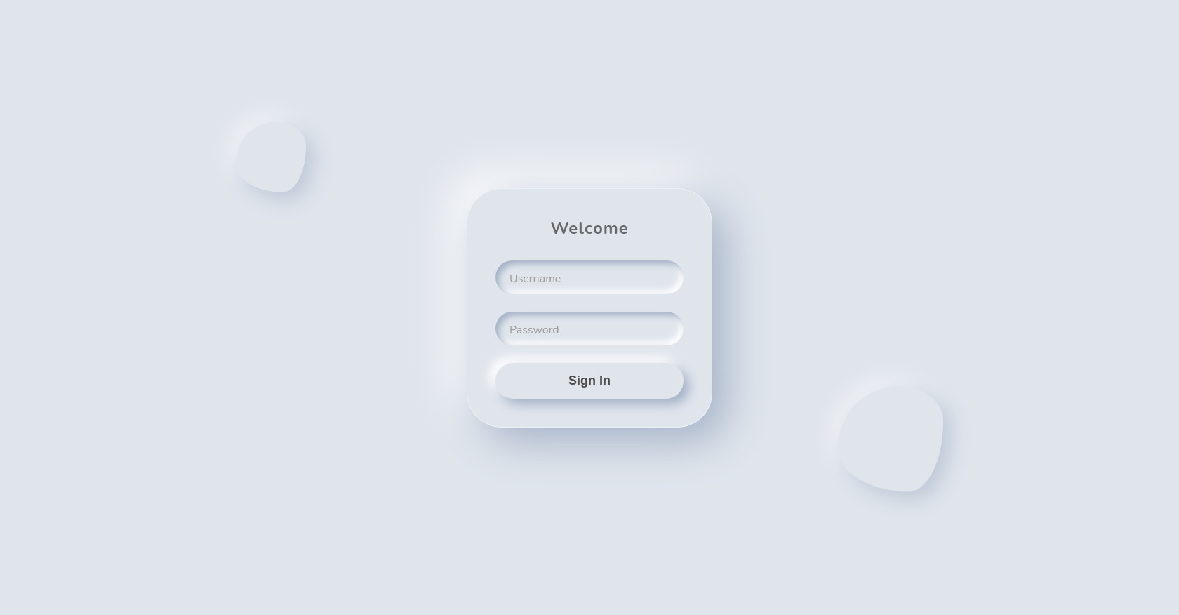
Exemple de code HTML pour un formulaire de connexion Jelly Morph
1,674
thedashboard1
Ouvrir dans l'éditeur
Publiez votre code
3
Recommandé
24 March 2026
CrazyGames HTML : Jeux en ligne gratuits
12 October 2025
Exemple de calques d'animation CSS
11 December 2024
Un code par slowapp370
HTML
Copy
Jelly Morph Login
Welcome
Username
Password
Sign In
CSS
Copy
@import url('https://fonts.googleapis.com/css2?family=Nunito:wght@400;700&display=swap'); :root { --bg-color: #e0e5ec; --jelly-color: #e0e5ec; --shadow-light: #ffffff; --shadow-dark: #a3b1c6; --accent: #ff00cc; /* Keeping a hint of the user's previous preference or just a nice pop */ --text-color: #4a4a4a; } * { margin: 0; padding: 0; box-sizing: border-box; } body { display: flex; justify-content: center; align-items: center; min-height: 100vh; background: var(--bg-color); font-family: 'Nunito', sans-serif; overflow: hidden; perspective: 1000px; } .container { position: relative; width: 100%; height: 100vh; display: flex; justify-content: center; align-items: center; } .jelly-form { position: relative; width: 350px; padding: 40px; border-radius: 50px; /* Soft, organic shape */ background: var(--jelly-color); box-shadow: 20px 20px 60px var(--shadow-dark), -20px -20px 60px var(--shadow-light), inset 0 0 0 transparent, inset 0 0 0 transparent; z-index: 10; transition: all 0.3s ease; animation: morph-form 10s ease-in-out infinite; backdrop-filter: blur(5px); /* Subtle glass feel */ border: 1px solid rgba(255, 255, 255, 0.4); } .form-header h2 { text-align: center; color: var(--text-color); margin-bottom: 30px; font-weight: 700; letter-spacing: 1px; opacity: 0.8; } .input-group { position: relative; margin-bottom: 25px; } .input-group input { width: 100%; padding: 15px 20px; border: none; outline: none; background: transparent; border-radius: 25px; color: var(--text-color); font-size: 16px; box-shadow: inset 5px 5px 10px var(--shadow-dark), inset -5px -5px 10px var(--shadow-light); transition: all 0.3s ease; } .input-group label { position: absolute; left: 20px; top: 15px; color: #999; pointer-events: none; transition: 0.3s ease; font-size: 16px; } .input-group input:focus~label, .input-group input:valid~label { transform: translateY(-35px) translateX(-10px) scale(0.9); color: var(--text-color); font-weight: bold; } .input-group input:focus { box-shadow: inset 2px 2px 5px var(--shadow-dark), inset -2px -2px 5px var(--shadow-light); } button { width: 100%; padding: 15px; border: none; outline: none; border-radius: 25px; background: var(--jelly-color); color: var(--text-color); font-weight: bold; font-size: 18px; cursor: pointer; box-shadow: 8px 8px 16px var(--shadow-dark), -8px -8px 16px var(--shadow-light); transition: all 0.2s ease; position: relative; overflow: hidden; } button:active { box-shadow: inset 5px 5px 10px var(--shadow-dark), inset -5px -5px 10px var(--shadow-light); transform: scale(0.98); } /* Floating Blobs */ .floating-blob { position: absolute; border-radius: 50%; background: var(--jelly-color); box-shadow: 10px 10px 30px var(--shadow-dark), -10px -10px 30px var(--shadow-light); z-index: 1; opacity: 0.6; } .blob-1 { width: 100px; height: 100px; top: 20%; left: 20%; animation: float 8s ease-in-out infinite, morph-blob 12s linear infinite; } .blob-2 { width: 150px; height: 150px; bottom: 20%; right: 20%; animation: float 10s ease-in-out infinite reverse, morph-blob 15s linear infinite reverse; } /* Animations */ @keyframes morph-form { 0%, 100% { border-radius: 50px 50px 50px 50px / 50px 50px 50px 50px; } 33% { border-radius: 60px 40px 50px 50px / 50px 60px 40px 50px; } 66% { border-radius: 40px 60px 50px 50px / 60px 40px 50px 50px; } } @keyframes morph-blob { 0%, 100% { border-radius: 60% 40% 30% 70% / 60% 30% 70% 40%; } 50% { border-radius: 30% 60% 70% 40% / 50% 60% 30% 60%; } } @keyframes float { 0%, 100% { transform: translateY(0); } 50% { transform: translateY(-20px); } } /* Dynamic Light Source Classes (applied via JS) */ .jelly-form.light-left { box-shadow: 25px 20px 60px var(--shadow-dark), -15px -20px 60px var(--shadow-light); } .jelly-form.light-right { box-shadow: 15px 20px 60px var(--shadow-dark), -25px -20px 60px var(--shadow-light); }
JS
Copy
document.addEventListener('DOMContentLoaded', () => { const form = document.querySelector('.jelly-form'); const inputs = document.querySelectorAll('input'); const button = document.querySelector('button'); // Dynamic Light Source Effect document.addEventListener('mousemove', (e) => { const x = e.clientX; const y = e.clientY; const centerX = window.innerWidth / 2; const centerY = window.innerHeight / 2; // Calculate distance from center const deltaX = (x - centerX) / centerX; // -1 to 1 const deltaY = (y - centerY) / centerY; // -1 to 1 // Adjust shadow offsets based on mouse position (light source) // If light is top-left (negative x, negative y), shadow is bottom-right (positive x, positive y) const shadowX = -deltaX * 30; const shadowY = -deltaY * 30; const lightX = deltaX * 30; const lightY = deltaY * 30; form.style.boxShadow = ` ${shadowX}px ${shadowY}px 60px var(--shadow-dark), ${lightX}px ${lightY}px 60px var(--shadow-light), inset 0 0 0 transparent, inset 0 0 0 transparent `; // Subtle movement for blobs to create depth const blobs = document.querySelectorAll('.floating-blob'); blobs.forEach((blob, index) => { const speed = (index + 1) * 20; blob.style.transform = `translate(${deltaX * speed}px, ${deltaY * speed}px)`; }); }); // Input "Squish" Effect inputs.forEach(input => { input.addEventListener('focus', () => { form.style.transform = 'scale(0.98)'; setTimeout(() => form.style.transform = 'scale(1)', 200); }); }); // Button "Swallow" Effect button.addEventListener('click', (e) => { e.preventDefault(); // Prevent actual submission for demo // Visual feedback button.innerHTML = '<span>Processing...</span>'; button.style.boxShadow = 'inset 5px 5px 10px var(--shadow-dark), inset -5px -5px 10px var(--shadow-light)'; setTimeout(() => { button.innerHTML = '<span>Success!</span>'; button.style.color = 'var(--accent)'; // Reset after a delay setTimeout(() => { button.innerHTML = '<span>Sign In</span>'; button.style.color = 'var(--text-color)'; button.style.boxShadow = '8px 8px 16px var(--shadow-dark), -8px -8px 16px var(--shadow-light)'; }, 2000); }, 1500); }); });