WEBLEB
Home
Editor
Accedi
Pro
Italiano
English
Français
Español
Português
Deutsch
Italiano
हिंदी
9666
Devtools_7
Apri nell'Editor
Video
Pubblica il Tuo Codice
9
Consigliato
29 December 2024
Una Home page alternativa
29 June 2025
Frammento di codice del menu a discesa HTML
HTML
Copy
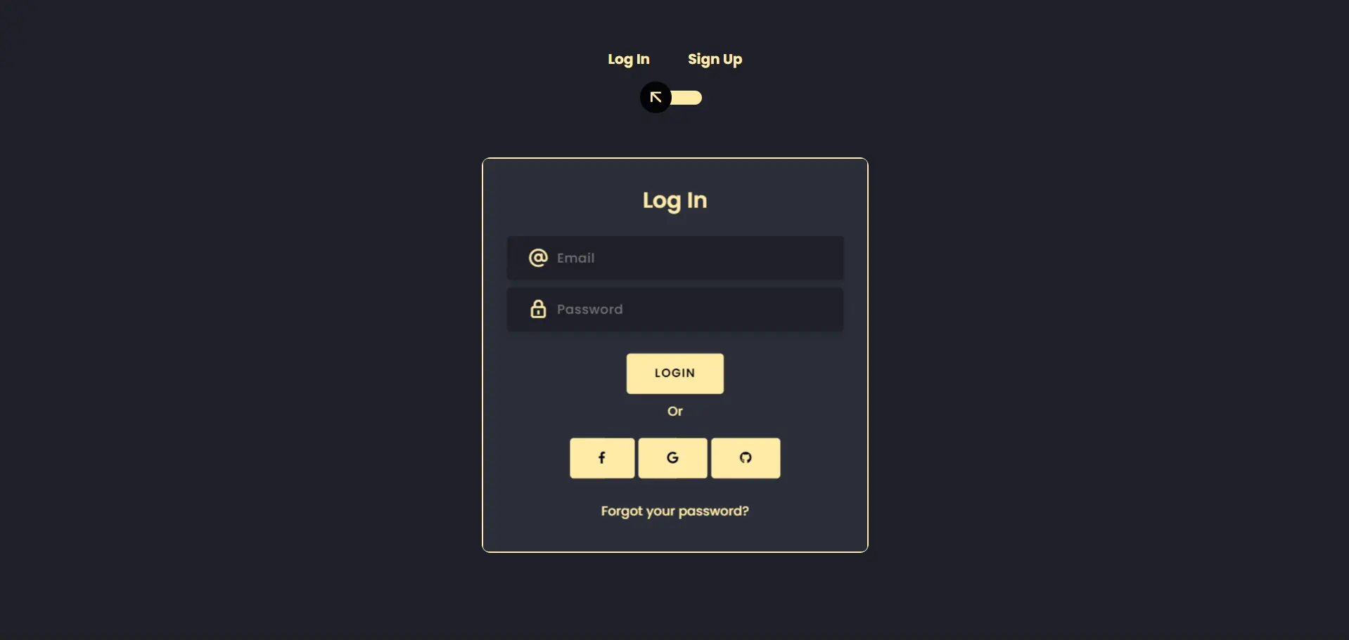
<!doctype html> <html lang="en"> <head> <title>Webleb</title> <meta charset="utf-8"> <meta name="viewport" content="width=device-width, initial-scale=1, shrink-to-fit=no"> <link rel="stylesheet" href="https://unicons.iconscout.com/release/v2.1.9/css/unicons.css"> <link rel="stylesheet" href="https://cdnjs.cloudflare.com/ajax/libs/font-awesome/6.3.0/css/all.min.css" /> <link rel="stylesheet" href="https://cdnjs.cloudflare.com/ajax/libs/twitter-bootstrap/4.5.0/css/bootstrap.min.css"> <link rel="stylesheet" href="/css/styles.css"> </head> <body> <div class="section"> <div class="container"> <div class="row full-height justify-content-center"> <div class="col-12 text-center align-self-center py-5"> <div class="section pb-5 pt-5 pt-sm-2 text-center"> <h6 class="mb-0 pb-3"><span>Log In </span><span>Sign Up</span></h6> <input class="checkbox" type="checkbox" id="reg-log" name="reg-log"/> <label for="reg-log"></label> <div class="card-3d-wrap mx-auto"> <div class="card-3d-wrapper"> <div class="card-front"> <div class="center-wrap"> <div class="section text-center"> <h4 class="pb-3">Log In</h4> <div class="form-group"> <input type="email" class="form-style" placeholder="Email"> <i class="input-icon uil uil-at"></i> </div> <div class="form-group mt-2"> <input type="password" class="form-style" placeholder="Password"> <i class="input-icon uil uil-lock-alt"></i> </div> <a href="https://www.web-leb.com/code" class="btn mt-4">Login</a> <div class="form-group mt-2"> <p>Or</p> <a href="https://www.web-leb.com/code" class="btn "><i class="fa-brands fa-facebook-f"></i></a> <a href="https://www.web-leb.com/code" class="btn "><i class="fa-brands fa-google"></i></a> <a href="https://www.web-leb.com/code" class="btn "><i class="fa-brands fa-github"></i></a> </div> <p class="mb-0 mt-4 text-center"><a href="https://www.web-leb.com/code" class="link">Forgot your password?</a></p> </div> </div> </div> <div class="card-back"> <div class="center-wrap"> <div class="section text-center"> <h4 class="mb-3 pb-3">Sign Up</h4> <div class="form-group"> <input type="text" class="form-style" placeholder="Full Name"> <i class="input-icon uil uil-user"></i> </div> <div class="form-group mt-2"> <input type="tel" class="form-style" placeholder="Phone Number"> <i class="input-icon uil uil-phone"></i> </div> <div class="form-group mt-2"> <input type="email" class="form-style" placeholder="Email"> <i class="input-icon uil uil-at"></i> </div> <div class="form-group mt-2"> <input type="password" class="form-style" placeholder="Password"> <i class="input-icon uil uil-lock-alt"></i> </div> <a href="https://www.web-leb.com/code" class="btn mt-4">Register</a> </div> </div> </div> </div> </div> </div> </div> </div> </div> </div> </body> </html>
CSS
Copy
@import url('https://fonts.googleapis.com/css?family=Poppins:400,500,600,700,800,900'); body{ font-family: 'Poppins', sans-serif; font-weight: 300; line-height: 1.7; color: #ffeba7; background-color: #1f2029; overflow: hidden; } a:hover { text-decoration: none; } .link { color: #ffeba7; } .link:hover { color: #c4c3ca; } p { font-weight: 500; font-size: 14px; } h4 { font-weight: 600; } h6 span{ padding: 0 20px; font-weight: 700; } .section{ position: relative; width: 100%; display: block; } .full-height{ min-height: 100vh; } [type="checkbox"]:checked, [type="checkbox"]:not(:checked){ display: none; } .checkbox:checked + label, .checkbox:not(:checked) + label{ position: relative; display: block; text-align: center; width: 60px; height: 16px; border-radius: 8px; padding: 0; margin: 10px auto; cursor: pointer; background-color: #ffeba7; } .checkbox:checked + label:before, .checkbox:not(:checked) + label:before{ position: absolute; display: block; width: 36px; height: 36px; border-radius: 50%; color: #ffeba7; background-color: #020305; font-family: 'unicons'; content: '\eb4f'; z-index: 20; top: -10px; left: -10px; line-height: 36px; text-align: center; font-size: 24px; transition: all 0.5s ease; } .checkbox:checked + label:before { transform: translateX(44px) rotate(-270deg); } .card-3d-wrap { position: relative; width: 440px; max-width: 100%; height: 450px; -webkit-transform-style: preserve-3d; transform-style: preserve-3d; perspective: 800px; margin-top: 60px; } .card-3d-wrapper { width: 100%; height: 100%; position:absolute; -webkit-transform-style: preserve-3d; transform-style: preserve-3d; transition: all 600ms ease-out; border: 2px solid #ffeba7; border-radius: 10px; } .card-front, .card-back { width: 100%; height: 100%; background-color: #2b2e38; background-image: url('/img/pattern_japanese-pattern-2_1_2_0-0_0_1__ffffff00_000000.png'); position: absolute; border-radius: 6px; -webkit-transform-style: preserve-3d; } .card-back { transform: rotateY(180deg); } .checkbox:checked ~ .card-3d-wrap .card-3d-wrapper { transform: rotateY(180deg); } .center-wrap{ position: absolute; width: 100%; padding: 0 35px; top: 50%; left: 0; transform: translate3d(0, -50%, 35px) perspective(100px); z-index: 20; display: block; } .form-group{ position: relative; display: block; margin: 0; padding: 0; } .form-style { padding: 13px 20px; padding-left: 55px; height: 48px; width: 100%; font-weight: 500; border-radius: 4px; font-size: 14px; line-height: 22px; letter-spacing: 0.5px; outline: none; color: #c4c3ca; background-color: #1f2029; border: none; -webkit-transition: all 200ms linear; transition: all 200ms linear; box-shadow: 0 4px 8px 0 rgba(21,21,21,.2); } .form-style:focus, .form-style:active { border: none; outline: none; box-shadow: 0 4px 8px 0 rgba(21,21,21,.2); } .input-icon { position: absolute; top: 0; left: 18px; height: 48px; font-size: 24px; line-height: 48px; text-align: left; -webkit-transition: all 200ms linear; transition: all 200ms linear; } .btn{ border-radius: 4px; height: 44px; font-size: 13px; font-weight: 600; text-transform: uppercase; -webkit-transition : all 200ms linear; transition: all 200ms linear; padding: 0 30px; letter-spacing: 1px; display: -webkit-inline-flex; display: -ms-inline-flexbox; display: inline-flex; align-items: center; background-color: #ffeba7; color: #000000; } .btn:hover{ background-color: #000000; color: #ffeba7; box-shadow: 0 8px 24px 0 rgba(16,39,112,.2); }
JS
Copy
/* Replace with your JS Code (Leave empty if not needed) */