WEBLEB
Home
Editor
Accedi
Pro
Italiano
English
Français
Español
Português
Deutsch
Italiano
हिंदी
20389
webleb
Video
Pubblica il Tuo Codice
6
10 December 2025
Demo Ragdoll di fisica HTML5: Matter.js Playground
18 December 2025
Caricatore HTML5 del gioco Escape Road e configurazione Firebase
index.html
Copy
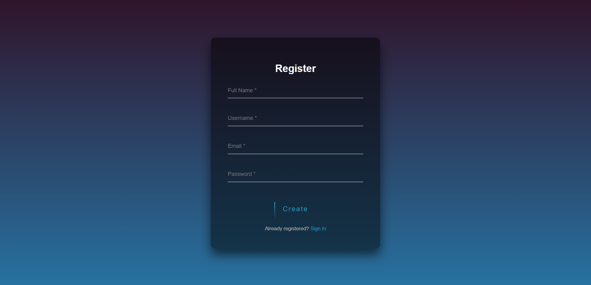
<!DOCTYPE html> <html lang="en"> <head> <meta charset="UTF-8"> <meta http-equiv="X-UA-Compatible" content="IE=edge"> <meta name="viewport" content="width=device-width, initial-scale=1.0"> <title>Webleb</title> <link rel="stylesheet" href="/css/styles.css"> </head> <body style="display:flex; align-items:center; justify-content:center;"> <div class="login-page"> <div class="form"> <form class="register-form" method="POST"> <h2>Register</h2> <input type="text" placeholder="Full Name *" required/> <input type="text" placeholder="Username *" required/> <input type="email" placeholder="Email *" required/> <input type="password" placeholder="Password *" required/> <a class="btn" href="#"> <span></span> <span></span> <span></span> <span></span> Create </a> <p class="message">Already registered? <a href="#">Sign In</a></p> </form> <form class="login-form" method="post"> <h2></i> Login</h2> <input type="text" placeholder="Username" required /> <input type="password" placeholder="Password" required/> <a class="btn" href="#"> <span></span> <span></span> <span></span> <span></span> Sign in </a> <p class="message">Not registered? <a href="#">Create an account</a></p> </form> </div> </div> <script src="https://code.jquery.com/jquery-3.6.0.min.js"></script> <script src="/js/main.js"></script> </body> </html>
styles.css
Copy
@import url(https://fonts.googleapis.com/css?family=Poppins:300); html { height: 100%; } body{ margin:0; padding:0; font-family: sans-serif; background: linear-gradient(#30142b, #2772a1); } .login-page { width: 400px; padding: 8% 0 0; margin: auto; } .form { position: relative; z-index: 1; text-align: center; position: absolute; top: 50%; left: 50%; width: 400px; padding: 40px; transform: translate(-50%, -50%); background: rgba(0,0,0,.5); box-sizing: border-box; box-shadow: 0 15px 25px rgba(0,0,0,.6); border-radius: 10px; } .form input { width: 100%; padding: 10px 0; font-size: 13px; color: #fff; margin-bottom: 30px; border: none; border-bottom: 1px solid #fff; outline: none; background: transparent; } h2{ color:white; } .form .message { margin: 15px 0 0; color: #b3b3b3; font-size: 12px; } .form .message a { color: #289bb8; text-decoration: none; } .form .register-form { display: none; } .btn { position: relative; display: inline-block; padding: 10px 20px; color: #289bb8; font-size: 16px; text-decoration: none; overflow: hidden; transition: .5s; margin-top: 15px; letter-spacing: 2px } .btn:hover { background: #289bb8; color: #fff; border-radius: 5px; box-shadow: 0 0 5px #289bb8, 0 0 25px #289bb8, 0 0 50px #289bb8, 0 0 100px #289bb8; } .btn span { position: absolute; display: block; } .btn span:nth-child(1) { top: 0; left: -100%; width: 100%; height: 2px; background: linear-gradient(90deg, transparent, #289bb8); animation: btn-anim1 1s linear infinite; } @keyframes btn-anim1 { 0% { left: -100%; } 50%,100% { left: 100%; } } .btn span:nth-child(2) { top: -100%; right: 0; width: 2px; height: 100%; background: linear-gradient(180deg, transparent, #289bb8); animation: btn-anim2 1s linear infinite; animation-delay: .25s } @keyframes btn-anim2 { 0% { top: -100%; } 50%,100% { top: 100%; } } .btn span:nth-child(3) { bottom: 0; right: -100%; width: 100%; height: 2px; background: linear-gradient(270deg, transparent, #289bb8); animation: btn-anim3 1s linear infinite; animation-delay: .5s } @keyframes btn-anim3 { 0% { right: -100%; } 50%,100% { right: 100%; } } .btn span:nth-child(4) { bottom: -100%; left: 0; width: 2px; height: 100%; background: linear-gradient(360deg, transparent, #289bb8); animation: btn-anim4 1s linear infinite; animation-delay: .75s } @keyframes btn-anim4 { 0% { bottom: -100%; } 50%,100% { bottom: 100%; } }
main.js
Copy
$('.message a').click(function(){ $('form').animate({height: "toggle", opacity: "toggle"}, "slow"); });