20388 webleb
Video
Veröffentlichen Sie Ihren Code
Empfohlen
14 September 2024
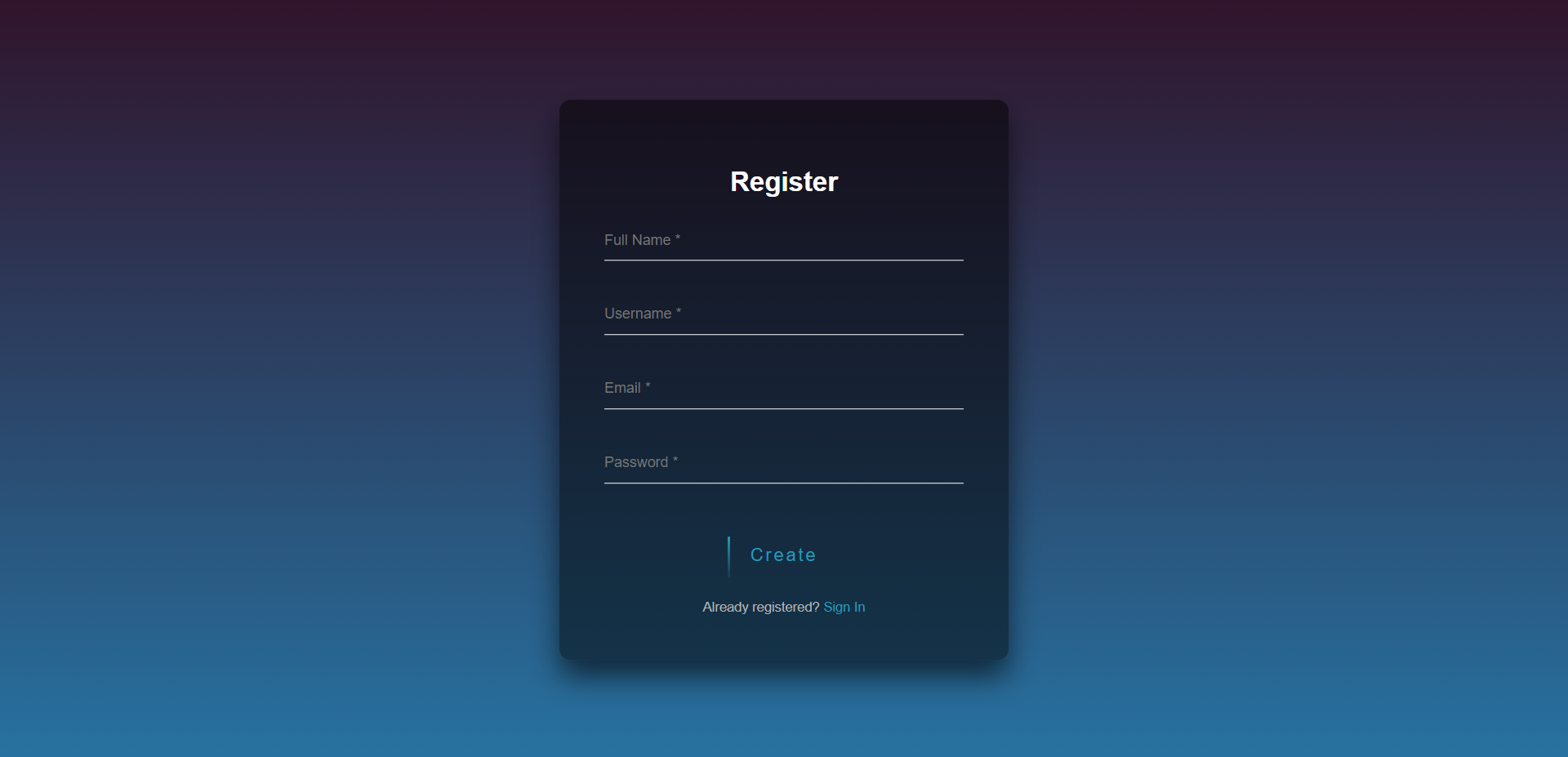
Modernes Anmeldeformular
15 July 2025
CSS-Dreieck-Umschaltanimation
10 September 2024