WEBLEB
Home
Editor
Login
Pro
English
English
Français
Español
Português
Deutsch
Italiano
हिंदी
interactive shape dance
491
ByBy.inc
Open In Editor
Publish Your Code
Recommended
16 September 2025
CSS Shapes Animation Example
15 July 2025
dom dance
HTML
Copy
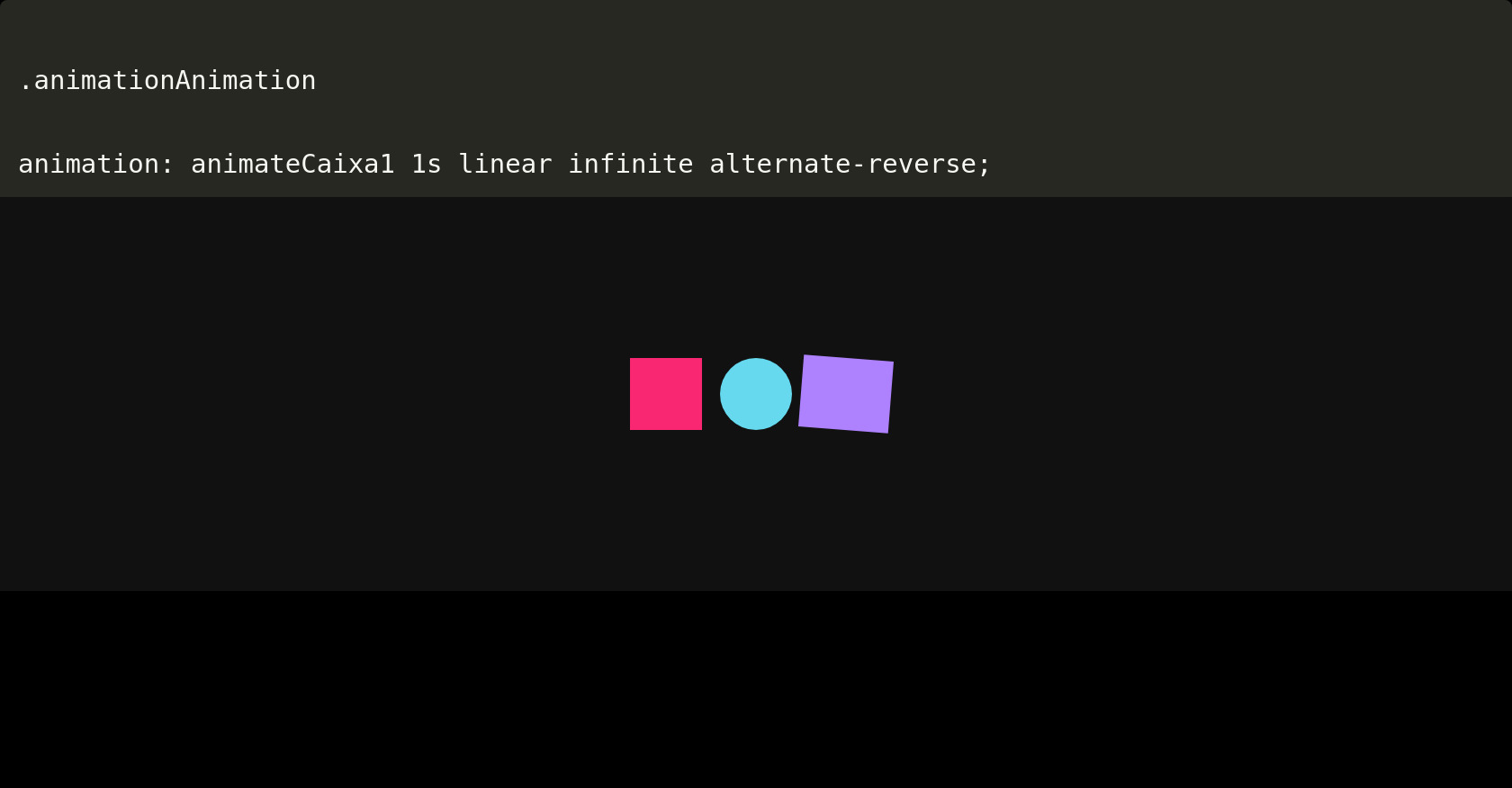
.animationAnimation
animation
:
animateCaixa1
1s
linear
infinite alternate-reverse;
CSS
Copy
* { margin: 0; padding: 0; box-sizing: border-box; } body { background-color: #000; display: flex; align-items: center; justify-content: center; height: 100vh; overflow: hidden; } .codigo { position: absolute; top: 0; left: 50%; transform: translateX(-50%); background: #272822; color: #F8F8F2; font-family: 'Consolas', 'Monaco', monospace; font-size: 29px; padding: 20px; border-radius: 8px; white-space: pre-line; text-align: left; line-height: 1.6; max-height: 50%; width: 100%; box-shadow: 0 4px 12px rgba(0, 0, 0, 0.3); } /* -------------------- Animando a caixinha 1 -------------------- */ .animationAnimation{ animation: animateCaixa1 1s linear infinite alternate-reverse; } @keyframes animateCaixa1 { 0% { transform: translateY(0); opacity: 1; } to 100% { transform: translateY(20px); opacity: 0; } } .animation-container { position: absolute; top: 50%; left: 50%; transform: translate(-50%, -50%); display: flex; align-items: center; justify-content: center; width: 100%; height: 50%; overflow: hidden; background-color: #111; }
JS
Copy
/* Replace with your JS Code (Leave empty if not needed) */